Colour Schemes for Italian Gardens

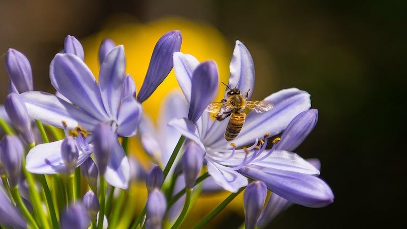
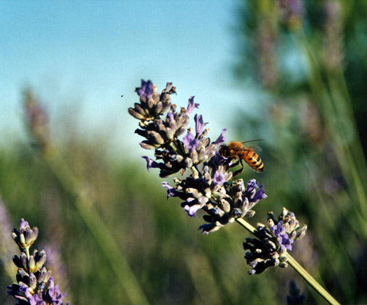
bee on lavender
Ever wondered why a field of bright red poppies look so stunning
against the light green grass of a Tuscan field in early summer, or
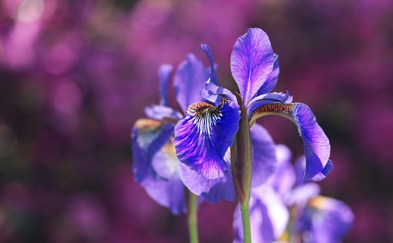
why the deep blue flowers of the Florentine flag Iris look so spectacular
set against their spiky, grey-green foliage, or why Lavender never fails
to stun with its beauty? Well, believe it or not there is actually a
scientific reason as to why certain plants attract the eye more than
some others, or why some plants are labeled as being “beautiful” and
others not- the reason lies in the intricate relationship between certain
colors and their tonal ranges. Take the bright red geranium for example,
whose image of stunning bright red flowers, cascading over the beautiful
verandas and balconies of small Italian villages in summer, has in some
way come to symbolize the image that most of us have of Italy.

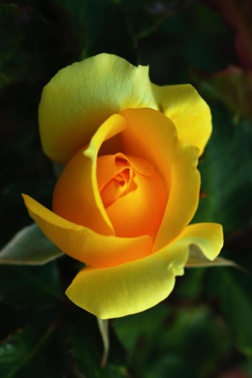
pierre de ronsard
The answer lies, as always, in nature as it is nature that has provided
these complimentary or contrasting color combinations simply to attract
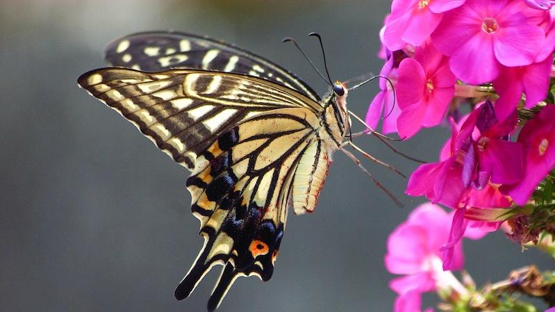
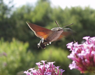
one of the most important insects- the humble honey bee and butterflies
as without the pollinating help of these industrious insects the plant
kingdom would soon almost grind to a halt. Some colors compliment or
contrast others and only by understanding which do which can we maximize
the potential for creating beauty in our own gardens. Colors that find
themselves opposite each other on the classic color wheel tend to contrast
with one another, creating a slightly more shocking combination i.e.
variations of red and yellow or blue and yellow.
Nature has utilized these combinations perfectly using color combinations
to catch the eye of any passing pollinating insect. However we humans
are equally impressed as our brains find it hard to distinguish certain
color contrasts, thus preventing the brain from being able to stop on
either, which stimulates a sort of flashing between one color and the
other- creating interest in the garden. However colors that are adjacent
to one another on the wheel create an altogether more pleasing and harmonious
color effect. Hot colors are known to have a stimulating effect on the
brain, unlike the cooler colors that are known to have a more relaxing,
tranquilizing effect on the human psyche.

poppy flower deep red
Therefore when we aim to excite with plants, maybe near the entrance
to a house or near a barbeque we can deploy the use of color contrasts,
as in the case of the stunning Geranium. Alternatively, if we wish to
create a relaxing area in the garden we can use harmonious color schemes,
using colors that lie adjacent to each other on the color wheel such
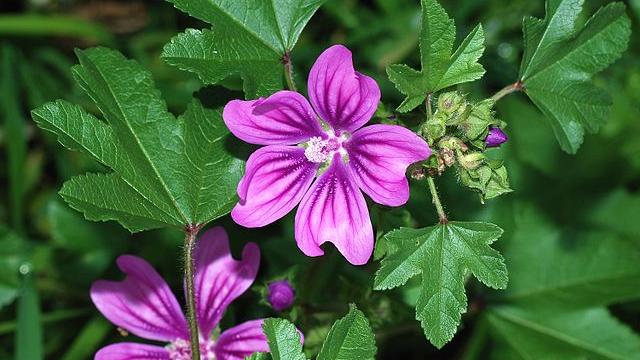
as pinks and blues, which can easily be seen when pink roses and lavender
are combined for example.
The metallic grays that can be found in plants like sage, lavender
and santolina, so typical of Italian herb gardens, act as a kind of
launch pad and tend to propel certain colors into the hypothalamus.
Therefore one needs to be aware of which color one plants amongst these
metallic grays as hot colors such as reds, oranges etc can become fierce,
whereas harmony can benefit from the addition of light grey as a backdrop,
intensifying the sense of harmony.

verbascum over blue
Even certain leaves such as the those of the Iris contain a certain
element of blue-green, metallic grey and even yellow which intensify
the color of their dark blue flowers, so should be used intelligently
and with care within a color scheme to avoid creating a confusing mess
that may just be having a disturbing effect your mood and life quality
for the time that you frequent the garden- a rather curious notion really
as it may not be the neighbor that has been bothering you for all those
years after all!!
By Jonathan Radford